Showing posts with label balance. Show all posts

Wednesday, July 20, 2011

Digital Art

Using Photoshop has inspired me to explore the realm of digital art, wallpapers and digitally rendered graphic design projects.

Photoshop is no easy software to master, however, the vast quantities of tutorials available out there on the internet, and the learning videos released by organizations such as Lynda and Total Training, make the job quite a bit easier for a rookie like me.


Traditional art is still my main area of expertise.


However, digital takes about one-hundredth of the time to complete.


In my time between the last post and the graphical revamp of the blog (done completely by me in Photoshop), I have created some...interesting pieces of digital art.

Some were created by following tutorials to the digit.

In others, I simply let my imagination and experimentation run free.


Here they are:


Wallpaper attempt 1
Adobe Photoshop CS4 Extended, Digital Painting 1920 x 1080
A more likable wallpaper attempt (at least to me)
Adobe Photoshop CS4 Extended, Digital painting 1920 x1080
A radical photo-manipulation of my friend Marc.
Adobe Photoshop CS4 Extended, Photo-manipulation 1440 x 900


A distant planet being visited by a strange starship.
Adobe Photoshop CS4 Extended, Photo-manipulation and Digital painting, 1920 x 1080


Digital art is possibly...more efficient than traditional media, but I personally think that it is not as valuable as traditional art because of the ease of it.

Going digital is absolutely perfect for the graphic designer.

With digital (especially with a tablet) you can achieve the most impeccably smooth gradient effects and lighting simulations.

Most importantly, with digital, you can step backwards and tweak your designs.

Unfortunately in traditional media, you must either start over or cut out and redo your wrongs.

There is a fine line between what you can achieve in traditional and digital media.
The difference is the ease of accomplishing these tasks.

I suppose that's why traditional sells for so much more than digital.

Tuesday, July 5, 2011

Playing with Photoshop

Graphic design is an interesting venture in terms of the factors necessary for grabbing the visual interests of the viewers while keeping the transmitter active to broadcast the necessary message to the specific viewer.

By definition, graphic design is the process of applying visual art and communication skills to create a medium in which a specific message can be conveyed to the specific target audience this message was meant for. It's all about presentation and clarity.


I personally have an extreme fondness for working in traditional media such as pencil or pen for undertaking these graphic design challenges, but recently, I have tried and succeeded in using digital media. 


Namely, Adobe Photoshop CS4.

However, don't get fooled, I haven't come anywhere near to doing what the professionals can do with this software suite (using Adobe Illustrator along with Photoshop).

But at least I'm trying some text effects.


I must say however, that the tutorials at PsdTuts are a colossal help to learning how to achieve some of these effects. The rest lies in personal touches and judgement by visual appeal.


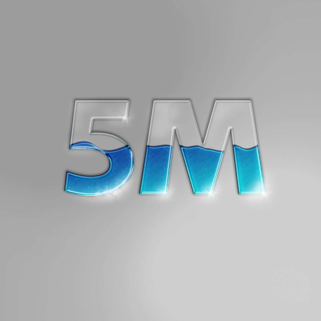
A nice little design with a subtle indication of the value my form class will be to Hillview in Form 5.


Experimentation for creating an effect of fluid within glass.
My very own experiment (observation, not tutorial) for making TRON effects text.


A grungy, gritty, urban sticker.


Playing with effects, layer masks, expanding my brush collection, expanding my font database and many other ways of toying around with this magnificent program is the way to achieving true design inspiration.

Of course, first you need to learn HOW to use the software.

I am still going through that journey, and it is indeed a long, winding road.

I STILL cannot do anything magnificent with PICTURES!!!


I use another, simpler program to accomplish that task, but they are indeed small edits. Nothing much to be raving about.

This vacation will be the perfect time for me to isolate myself from my normal interactions and truly develop the skills needed to take myself to the next level.

Both in terms of artistic development and academics.

CXC is next year >.<

Sunday, April 24, 2011

HOUSE


I am a passionate photorealist. I cannot fully appreciate pieces that lack detail unless they vividly depict a deeper, alternate meaning than what is presented at face value. I strive with all of my being to include as much detail as possible into all of my pieces. The full effect of photorealism is achieved through the application of high contrast, painstaking shadowing and the inclusion of as many details as possible.

In portrait work, it is even more important to pay attention to these principles in order to create an impressive replica of the subject in portrait.

However, one must also pay rapt attention to the details of the layout of the face and the person's features. Accuracy in this department will aid in ensuring that the portrait looks just like the person.

A fellow blogger, Portia Subran (a.k.a. DeadEyes), has experience in developing portraits.

You can find her at The Art of Wisdom and War


Anyway, its my turn to show 'off' my portraits too.

It's been a while since I've done a proper portrait. 

Not counting the one I've just completed, the last portrait I created was completed on the first of September last year.

Wow....it's been a while.

Personally, I think that I have definitely improved upon my techniques and my rendering capabilities but I definitely have to continue working hard at improving my accuracy and proportion mapping.


The following picture shows the first portrait I EVER completed:

A 'failed' portrait of Dr. House  


House M.D. (Portrait 1), Graphite on paper: 14" X 17".
I definitely have improved since then.


If you take a close look at the portrait, I signed this piece over a year ago.

Since then, things have changed.


My ability to achieve shadowing has improved and I am proud of what I am able to achieve nowadays in my artistic studies and exploration of expression.
I was heavily advised to stop doing portraits of these famous people, so I thought I would let them go out with a bang.


One year later, I decided to take Dr. House for a spin again...

 
I definitely am proud of my improvements, but I leave the verdict up to my readers to tell me where I have to continue the physical practice and research necessary to become a better portrait artist.


Simply more than a year has helped me improve my techniques to a level beyond my own expectations.

On the 22nd April, 2011 This is how the NEW House M.D stands:


House M.D. (Portrait 2), Graphite on paper: 17" X 22".
Improvements galore.


So concludes another vacation in the life of a dedicated student and a very tired human being. The trials of academics and art help make me stronger at least, so there is some good that comes out of hard work.....

This is my last portrait of an internationally famed person who is not locally based.
In the future, I may post some pictures of my previous portraits which include the likes of Queen Latifah, The Joker, Taylor Swift, and last (but not least) Ellen DeGeneres.

Due to my return to the hectic life on Tuesday, my posts may start to dwindle in frequency, but I will try to update as best as I can.

Thursday, April 7, 2011

The Testing Period


As the school term has basically come to a close, assessments for all subjects were in order.

There were exams, there were assignments and there were...presentations.

For our Visual Arts assessment this term, we were given the opportunity to present four of our pieces for critique and subsequent marking.


The first piece of the puzzle was the graphic design effort towards creating album art for a musician's debut album release.

As such, it is supposed to clearly reflect on the type of person/group presenting the music; while also showing the distinct genre being offered.


The next critical piece was a self portrait to be done in the student specific media assigned.


I was able to select the option of completing my portrait in ink.

I have developed a fondness for the high contrast possible with penned pieces after completing the Alfred Codallo copy last term.

This is my completed self portrait.

I personally love the maze effect...


Being a 'dedicated' student, I clearly followed my teacher's instructions on the specific time period in which to pursue the construction of the T- shirt designs and the application of it to the textile.


As such, I missed out on the opportunity to paint various Hillview landscapes from observation.

While the other students could have submitted this landscape study as their fourth piece, I was pressed to find one out of my portfolio that was of the same standard as my other pieces while it could be allowed for presententation (for example, not one of my casual portraits or any work from last term).

As such, I decided that a suitable still-life would be the most efficient method of gaining a suitable fourth piece in the space of two days.
I assembled the composition myself using art materials from the studio and I worked tirelessly at completing my work.


At the end of a smooth presentation on Monday, I was pleased to learn that my hard work earned me an acceptable 93 in Visual Arts.

I suppose I will have to work harder next term to get even closer to my goal of a perfect score.

Wednesday, March 23, 2011

The Art of Design


Artistic expression can take many forms.


There's drawing, there's painting, 3-dimensional imaginative pieces, 3-dimensional craft and textile work.
The influence of fashion in today's world has far extended beyond the boundaries of the female.

Men are becoming more conscious of their appearance and we artists can EXPLOIT these...wonderful opportunities for some extra creativity (and revenue).
Fashion is a cutthroat facet of life.

It's either you have the best, or you have nothing at all.
The common thought among er...wealthy fashion addicts is that "I'm only wearing originals! No imitations or franchise clothes."

What's more original than a piece of clothing created by an artist?
No company branding, no chance of a replica and the highest level of DESIGNER ORIGINAL clothing available...


As the title states, The true process is all in the design.
As can be seen in TODAY'S society, brand name doesn't mean much anymore.
The quality assured by the brand before has been almost entirely removed by get rich quick schemes which skimp on quality but care about quantity.

Some of the most beautiful designs are best kept in small quantities so that a level of appreciation can be felt when these are seen.

They're almost magically rare...


And so begins my tale of the t-shirt.
This abstract looking t-shirt was the final product of an accidental design (this seems to be an everyday occurrence for me these days :/ ).

I decided that we live in a bright, steaming hot tropical island, and this t-shirt should reflect some of that.

In contrast to international designs which use straight edges and sharp corners (which I like by the way), CURVED edges were used.

I have a progress picture of the garment with about half of the work already completed:


I hope to have it 100% completed soon and have some model shots of it!!

This is my re-introduction to textile design.

It's quite fun and this will be my new favourite t-shirt store, my room.

Sunday, October 10, 2010

Entry 2

ARTIST’S LOG
Entry2
07/09/2010


Minimal practical work was done in today’s class due to restraints in time. However, we learnt many new theoretical aspects and guidelines by which we can improve our work, especially in the branch of graphic design such as the elements and principles of design. Exercises in balance were also conducted as seen below.

The simple geometric shape of the circle was drawn three times within a rectangular box. Each circle per box was given a different size to change the balance of the box.
Balance is affected by size, colour and placement of the object, so bigger, darker, lower objects will appear heavier while small, lightly coloured, high objects appear lighter.

The Elements of design are:
  • Line                          
  • Shape
  • Form
  • Colour                      
  • Texture (tactile or visual)
  • Space
  • Value

The terms tactile and visual as it relates to texture refer to the use of realism or optical illusions. For example, using body paint, one can change one’s skin colour to an inhuman metallic effect detectable by the eyes, but the skin still feels normal to the touch. This can be manipulated in graphic design to achieve unique effects in relation to the piece under construction.

The Principles of design are:
·         Balance
·         Emphasis
·         Movement
·         Pattern
·         Rhythm

LinkWithin

Related Posts Plugin for WordPress, Blogger...

Popular Posts Last Week