Showing posts with label critique. Show all posts

Friday, March 23, 2012

Graphic Design: The Commercial Artist


As someone once said, in a nutshell, Graphic Design is the artistic technique to make information fun to read. Graphic design combines typography and illustration to effectively communicate a message to a specific audience. This combination of text and imagery is utilized within a shared space to create an aesthetically pleasing manner of communication between audience and broadcaster. Graphic designers are often employed in the media and advertising industries.

Common forms of graphic design include logos and branding, publications such as magazines, newspapers, and books, print and video advertisements and product packaging. Composition is one of the most important features of graphic design, especially when creating a unified layout for the integration of text and imagery.


David Smith

David Smith is a graphic artist and art director. He works in advertising agencies as the head of the art department. His department handles the design and production of print advertisements which range from newspaper ads to magazine publications and even to outdoor billboards. His department also manages television commercial design.

David Smith was born to Neil and Vida Smith on 21st March, 1955. He grew up in a quaint house on 16 Dundonald Street, Port of Spain, Trinidad.

Always having a love and fascination for the visual arts, David Smith began pursuing his dream of a career in the arts soon after his graduation from Tranquillity Government Secondary School. There was an advertising agency just around the corner to his home where he began his career as a trainee. As he knew little about the graphic design industry, he pursued a three year full-time Communications Design course at the John Donaldson Technical Institute, Port of Spain, Trinidad.

David Smith has been a graphic designer for over 25 years. He considers himself to be a sort of perfectionist when it comes to his artwork. He pays a considerable amount of attention to detail and continuously makes the extra effort to refine his works into the overall most effective communication of the client's product or service. He remarked once that as a graphic designer is more limited in expression than most fine artists because the final products MUST be pleasing to the client's tastes and specifications.

Mr. Smith's favourite medium is definitely the pixel. His entire creative process occurs behind his computer monitor, from conception and manipulation of the idea to the eventual refinement into the finished works. According to the artist, the convenience, versatility and efficiency of computer graphics is the major reason for his preference. He reminded me that research is a critical part of the design process. It is used as a tool for reference in terms of other existing designs and as a medium to gain inspiration and produce new innovative ideas.

Apart from graphic design, the last piece of fine art commissioned by David Smith was created around 1997. This is due to a lack of free time due to his career. He remarked that after a long, stressful day of design, the only thing he likes to do is to simply unwind and relax in the comfort of his own home. 


At his current advertising agency, one of the primary projects they work on is packaging design. One of their most prominent clients is the ABIL group. ABIL is one of the largest manufacturing companies in Trinidad. As such, his organization is responsible for designing the packaging of various products of Charles chocolates, Sunshine Snacks and Devon biscuits. When new products are released, new packaging must be designed, hence his plate is always full.


He considers one of the greatest achievements of his career to be his promotion to assistant art director in his early twenties. He was quite possibly the youngest designer to be granted that promotion in the country. Inevitably, his next great achievement was his promotion to art director, thus becoming the head of the art department.

David Smith, graphic designer and art director, loves his line of work. "There are times, because of the stresses that I don't love it as much." he joked. When asked if the design career is indeed a lucrative one, he responded that the fruits of a graphic designer's labour is very much dependent on his knowledge, skill and experience. According to him, the monetary returns of this line of work is worth all of the stresses and hassles involved. Also, the advertising agency employing the graphic artist is a major variable in the salary of the designer.

"It is a very, very stressful job." he admitted. He said that they are constantly working towards deadlines unlike in fine art. Another major source of the stress in the industry is the indecision of clients, especially those that are nearly impossible to please. Also adding to the stress, tension and possible frustration is the fact that most agencies handle the advertising needs of several clients simultaneously, thus adding to his workload. However, he believes that the majority of the public does not fully appreciate the hard work and effort which is placed into creating meaningful pieces of graphic art.


Fine artists have formed their reputations by appending their names to their works, however pieces of graphic design are usually anonymous. Mr. Smith stated that unless your name is associated with the company you work under, the reputation of a graphic artist is spread by word of mouth. On most occasions, the credit is given to the advertising agency and not the designer himself.
A pet peeve of his is the lack of respect sometimes given to graphic artists. It is his view that despite the customer always being right, there are some boundaries that should not be crossed. It is his belief that the client should also respect that graphic designers are professionals at what they do and the client should place more trust into the designer's judgement. He lamented that clients often think that they can do the designer's work better than them. Sadly, this is not the case.

Another irritation he constantly faces in modern society is the arrogance and ignorance of most casual users of photo-editing software or websites such as Picnik. It is a reality that most of this category of users are not educated about the graphic arts, however they believe that they are professionals simply because they can use these programs. He applauds their determination to further themselves as designers, but he simply resents the arrogance and smug attitude of most of these novices.

When asked to provide any advice to young and upcoming graphic artists, he remarked that having a creative mind is a necessity in the industry. Apart from having a high level of skill, a competitive edge is gained if the designer has the ability to come up with new innovative ways for the communication of the client's ideas.
He also recommended for those aspiring towards a career in the graphic arts to participate in certified communication and graphic design programmes to further their skills and knowledge. Furthermore, they must become adept at using the industrial standard of graphic programs, namely the Adobe CreativeSuite. Professional graphic artists must learn to master Adobe Photoshop, Illustrator and InDesign. Designers must always keep abreast of new program releases and updates to graphics software.

Some more of David Smith's work is featured below:


More of Mr. Smith's work can be found at his digital portfolio at dsmith.carbonmade.com

David Smith continues to strive to be the best he can be and use all of his skills to become a better graphic designer. When asked about his plans for the future, he said that he simply plans to keep abreast of modern trends in advertising strategies and become the best he can be.

Saturday, December 31, 2011

Year in Review: 2011


Here we are once again, facing the end of another year while eagerly awaiting the genesis of another. As time races by, one must always take some time out to reflect on the events of the year past to examine one's achievements as well as one's shortcomings.


This year has exposed me to a diverse range of experiences. The year two thousand and eleven has taken me from tragedy to triumph and back.


With 2011 almost behind us, I will take this opportunity to recap my experiences this year in the visual arts.

In no particular order:


  • Republic Bank - Young Artists' Canvas to the World Project


In December of the previous year, 2010, I entered into Republic Bank's Young Artists' Canvas to the World Project.  Forced to paint during my end of term examinations of my first term in Form 4, this competition put my body and mind under a very large quantity of stress.

Thankfully, after a week or two of hard artistic labour between exams, as well as a very long month of tense waiting, I was invited to the awards ceremony at Republic Bank's head office.

There, I was announced as one of the seven winners of this competition. One of the champions.

My winning piece: The Magic of the Monarch


My winnings included $5,000 in cash for myself, $5,000 in art supplies for my school and the exhibition of my piece of art at the Piarco International Airport and at the Trincity branch of Republic Bank.

You can read the entire trilogy of this story starting here.


  • HOUSE M.D. Portrait


Earlier this year, at the beginning of my Easter vacation, I started a new portrait. The subject of this portrait happened to be a favourite television character of mine, Hugh Laurie in the role of Dr. Gregory House.

However, at the private viewing of Canvas Caribbean's exhibit, With an Open Mind, I was advised by my visual arts teacher to stop doing portraits of foreign celebrities. Hence I decided that since this was the last portrait of these celebrities and characters originating outside of our shores, I would be letting this one go out with a bang.

This decision as well as an improvement in my skills led to the birth of my (now famous?) graphite portrait of Dr. Gregory House.


This is currently my flagship portrait, but who knows how long it's reign as my best portrait will be?
2012 seems like a very long year filled with opportunities for me.


This portrait has been very influential in many of my successes this year.

You can read more about this portrait here

This brings me to my next achievement...


  • Guide to Online Schools' Student Blogging Awards


To all of those who can remember this button, I am deeply grateful for your support, your time and your energies towards promoting my blog. Your tireless voting put me into the winning spot once again.

With your appreciation of my post on the House M.D. portrait, your tireless voting placed me into the top 10 of the competition. Then, a panel of judges selected the five winning posts based on their quality.

I was one of those five.


You can read more here


  • Caribbean Beat Magazine

  Republic Bank was also responsible for another accomplishment of mine, being semi-featured in the Caribbean Beat magazine. This magazine is available free of charge to all passengers of Caribbean Airlines and Air Jamaica on their respective flights.

In the article in the May/June issue of this year, Republic Bank spoke about the success of the competition and its impact on the lives of its participants and its winners.


I was elated to see that out of the seven paintings, they chose mine to display on their article.


You have the opportunity to check out this issue of Caribbean Beat magazine by clicking here


  • Heritage - The Knowsley Building

With this being a year of many firsts, it was only fitting that I try to do something groundbreaking. Something that would make people talk for days, weeks, months, even years about a piece of art created by someone so new to the industry.

I wanted to make a statement that professionals need not be these larger than life, detatched individuals.

Greatness can be achieved without losing oneself to social constructs.
Individuality is key in becoming legendary.

Just look at classical Trinidad architecture.


Also, with this being my first major architectural focused landscape, I intended to set a high standard for my work. After five weeks of painstaking detail, shadowing and artistic substitution, 'Heritage' was born.

Heritage - 2011, Graphite pencils on paper: 22" x 17"

As it turned out, this piece along with my portrait of Dr. House became my premier pieces at my school's inaugural Visual Arts exhibition.


  • Secrets: The Inaugural Exhibition

As a student of Hillview College, I have the ability to represent my school by the way I conduct myself and the things that I do. I can choose whether to be a positive change to society or to succumb to the pressures of negativity and conformity to the social environment we exist in.

When given the opportunity to display my artwork for the public eye, I must admit that I was a bit concerned underneath all of my excitement and intrigue. However, after the magnificent experience I gained from this occasion, I have faith that my generation can rise from the ashes of Trinidadian society and construct a new reality for the future of the minds of this nation.


Secrets has been a very enlightening experience for myself as I experienced first-hand what it feels like to make a positive impact on others, no matter how miniscule that impact is.

I felt appreciated by people who hardly knew me, I became a celebrity for a week :) , I received some harsh critiques as well as some heartwarming compliments for my efforts. I experienced some extreme contrasts but I deeply appreciated every moment that was bestowed upon me during our exhibition.

You can catch a glimpse of some of the exhibition pieces here


  • The Gourmet Genie


As my first clients in the sphere of Graphic Design, I am deeply grateful to the owners of the Gourmet Genie for taking a leap of faith in hiring me to create a television commercial promoting their business in Southern Trinidad.

The Gourmet Genie is a lovely little store which specializes in gourmet food items, teas, coffees, seasonings etc. They also feature 'as seen on TV' products from a variety of famous Food Network personalities.

You can find the Gourmet Genie at Ground Floor, SSL Building, 40 Sutton St, San Fernando


Feel free to visit their Facebook page


And so ends another year in our lives. Was it a worthwhile one?
The year ahead is filled with opportunities to embrace as well as those to decline.


My advice to you is to set your standards high and keep your goals in sight in the coming year.
True success and happiness is born out of hard work and committment.


Have a safe, successful and rewarding 2012.


Saturday, December 17, 2011

Secrets: The Exhibition

The first term of Form 5 is finally over.
Now I have the time to update the blog.

There have been quite a few hurdles to overcome this term and there have been a great deal of troughs and crests in our preparation for our inaugural art exhibition, Secrets.


The prospect of hosting an art exhibition at our school was very overwhelming when the idea was first conceived in May, 2011. At that point in time, we were 'enjoying' the all round pressures of the last term of Form 4 and as art students, when Mrs. Tappin - Davis announced that we had the opportunity to host an exhibition, we were very excited at the prospect of showcasing our work to the public.


Needless to say, the journey was a long and hectic one, but it was very much worth it in the end.

In our brave journey into the unknown, our art teacher and we upper school artists single handedly established Hillview College as an institution with a diverse selection of opportunities for academic improvement.


We placed Hillview College on the map for the study of the Visual Arts.


The opening night was abuzz with excitement as specially invited guests enthusiastically browsed through the diverse offering of the artworks created by students of Form 5 and 6.

Our exhibition boasted a total of thirty pieces from seven different artists.
Our display was held in the college's main hall/auditorium.


 Each of our thirty easels were adorned with artworks from our Form 6 artists such as Stephen Prince and Nikolai Maximay as well as our Form 5 artists including Duane Swift, Geovanni Ram, Marc Harroo, Matthew Babwah and myself.


Here are some samples of the artworks which were exhibited:

I shall start the display with my own pieces.
These very pieces gained me a perfect score in this term's Visual Arts assessment.
You may see some of my older pieces as well among the new creations.


All of my pieces:
Form 5M 
Johnathan Smith
Johnathan Smith: Copy of The Bongo Wake - 2010, Pen and Ink : 14" x 17"

Johnathan Smith: House M.D. (portrait 2) - 2011, Graphite on paper : 17" x 22"


Johnathan Smith: The Spiral - 2011, Mixed Media : 18 x 24
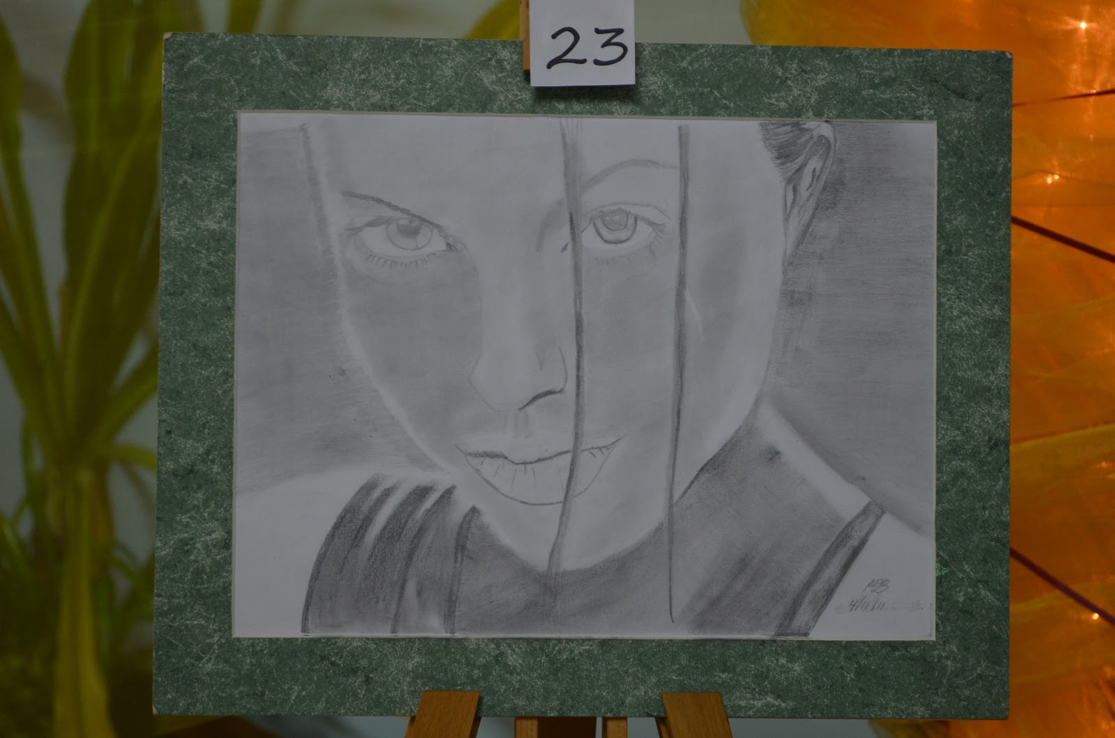
Johnathan Smith: Figure Drawing study - 2011 , Graphite on paper : 17 x 22
Johnathan Smith: Heritage - 2011, Graphite on paper : 17 x 22
Johnathan Smith: Pot of Gold - 2011, Mixed Media : 11 x 15


The other artworks were contributed by our Form 6 students, Stephen Prince and Nikolai Maimay, as well as the other students in my Form 5 class. I have included two samples each of my favourite pieces from their collections as well:


Form 6
Nikolai Maximay


Form 6
Stephen Prince


Form 5E
Matthew Babwah


Form 5M
Marc Harroo


Form 5W
Geovani Ram


Form 5M
Duane Swift


Secrets has raised much awareness about the artistic talents which can be found within the walls of the nation's secondary schools, especially those within Hillview College.

Honestly, who will take over as the nation's next generation of artists?

It starts with us, the youth.
Which brings me to another point...


I was elated beyond words by the dramatic turnout of Hillview's student population, on a daily basis, to the auditorium to experience our exhibition.

As Mrs. Tappin - Davis once said, the students came into this exhibition as an oasis from all of the stresses inside of the classroom. Inside of the auditorium, all wild behaviour and horseplay ceased. For the first time in my five years at Hillview, I saw a different side to the students.

They were serene.


I was also elated by the visit of the art students of two other secondary schools.

The Forms 3 - 6 art students of El Dorado East Secondary School and Gasparillo Secondary School both visited our exhibition that week. It was a very enlightening experience for me due to my own personal ignorance of art's appreciation in this country.

After seeing the neglect and pressures faced by the nation's art community, it was extremely refreshing, relieving and invigorating to see so many youths with a passion for the arts. Every single one of them displayed an indiscriminate love and passion for furthering themselves in the artistic realm. Their excitement fueled my love for the arts further simply by knowing "there are more of us out there in society".

It was an honour being part of this inaugural exhibition.

OUR exhibition.


Tuesday, October 25, 2011

The Fundamentals of Photorealism (Pt. 1.5)


The main difference between a photorealist and an impressionist is the painstaking attention paid to detail.

Photorealists must not give up until every shadow falls at its perfect angle, until every glimmer of light is reflected accurately, until you can feel the textures while gazing into the art form, until every single molecule of the subject is captured on your artwork.

When you set your standards to this level, your shortcomings are masterpieces in themselves.


You must be ruthless to attain perfection; whatever your definition of that may be.

Every single piece you complete must be seen as a stepping stone to another standard.
Never believe to yourself for one moment that you have succeeded.


You must remember that your achievement is just as temporary as everything else in life.
You can only get better.

A perfect example is my progress with portraits.


Just as with academics, when you believe that you have become the best, or very near to it, you begin to slack off and think that your current level of expertise is enough to carry you forwards forever.

THIS IS WRONG.

Never stop trying to be better, because one day, you WILL realize how far you have come.

Also, never stop adapting to new techniques and new media.

Life is a classroom, death is the only thing that stops you from learning more.

Wednesday, September 21, 2011

Trailer Deconstruction


I've realised that I would only be able to do a proper deconstruction of a trailer that has an emotional connection to me; something that I would enjoy doing...

Star Trek.

One of the most successful science fiction franchises in history. The roots of this franchise began growing way back in 1966 with the television airing of Gene Roddenberry's visionary ideals.


However, most sadly, in recent times, this franchise was seen as a dying one by the general public and by  Paramount studios. Paramount was desperate to reinvigorate the franchise and they did so by making a very bold move by introducing J.J. Abrams to reboot the franchise.

The following is quite possibly my favourite teaser trailer of all time.


I remember the very first time I saw this trailer.
I was screaming in ecstasy when I saw the hull markings spell out 'U.S.S. Enterprise'.


This trailer was very, very well designed.


What made this trailer so fantastic in achieving a resounding effect on me is the element of surprise.

I could only imagine how those lucky patrons felt when this trailer played before Cloverfield on the grand silver screen... Oh how I wish I was there.


SURPRISE

The trailer begins with a very 20th century image of a welder, toiling hard at his task in a very dark atmosphere. This looks like a movie set in our normal timeline of Hollywood movies, nothing too interesting looking at first, right?

Then we see that J.J. Abrams is directing.

We hear iconic words from the 1960s.

Words, quotes, emotions pouring out of those witnessing the life of the space race of the 1960s.
We hear former U.S. President John F. Kennedy and his words to the world...

This movie is definitely a space movie.

Well then, this seems a lot more interesting now!

Who expected what we would see next?


TACT AND STRATEGY

The brilliance of this trailer also lies in the execution of  the revelation of this grand, elaborate scheme to the regular moviegoers WHILE still appealing to existing fans of the franchise like me.

The use of welding does quite a lot to cement the fact that this is not science fantasy, but science fiction.

In English, that statement simply means that the gritty, sweaty, MANUAL atmosphere we get from assembling something via welding makes us remember that this is not a ridiculously happy fantasy world where only stark contrasts exist.

The intertwining of quotes from the space age create a sense of destiny; a feeling that this is not simply ridiculous science fiction that can just be forgotten after seeing it.

This trailer makes us feel that this movie may just be a prediction of the future rather than a simple fantasy.
The pulsating beat and rhythmic fade transitions conjure a sense of suspense and grandeur as the camera pans over the starship under construction.

The strategic panning over the ship reveals very little until everything is dropped on us at the end.

At 0:46, the rising crescendo masks the subtle emergence of the bells and chimes used in the title sequence of the original Star Trek series as well as that of 'Star Trek: The Next Generation' tv series.


And then It happens...

"Space, the final frontier..." 

At this point, my jaw had hit the floor and my cardiac muscles were ready to burst through my chest cavity in pure excitement.Those legendary words were mouthed by Leonard Nimoy himself...

This is Trek.

And even better...
They played the original theme during the Enterprise's reveal...

When my eyes and ears encompassed the next sight, adrenal pleasure surged through my body. I still get chills watching this trailer...

Instead of using the words 'Star Trek' to represent the movie, they did something very different.
A gleaming Starfleet emblem shone out of the darkness as a beam of light illuminated its contours and then enveloped the entire symbol.
The timeless icon of the Star Trek franchise.


The modernization of the old sound effects from the 1960s TV show, and the redesigned Federation flagship U.S.S. Enterprise, breathe new life into classic material and creates a new opportunty for the franchise "to boldly go where no one has gone before". 


This is, in my opinion, a masterpiece of a teaser trailer despite what anyone might think of the movie itself or the franchise it belongs to.

Thursday, April 14, 2011

Canvas Caribbean "With an Open Mind"


I was recently invited to attend the private viewing of Canvas Caribbean's latest exhibit, “With an Open Mind”. This prestigous exhibit was being held at the Gallery at Fine Art, Woodbrook. 


To be brutally honest, I was quite disappointed with the gallery itself. Every exhibition I have attended in the past boasted a beautiful, visually enticing gallery which pulls you inside to view the pieces with even more interest.

This was not the case with the Gallery at Fine Art. The building seemed like an ordinary, outdated Port-of-Spain commercial building constructed in the bygone era of boxy shapes and semi-curved walls.

However, despite my dissatisfaction with the architectural design of the building, I must say that I was impressed by the quality of most of the pieces exhibited.

Upon entering through the glass entrance of the gallery, an immediate feeling of excitement, competition, chaos and sheer madness could be felt emanating from the already energized patrons.

Due to my late arrival, I unfortunately missed out on an inspiring speech by the passionate Pat Bishop. However, her strong presence was still felt even without hearing her words personally.

This exhibition boasted a total of 82 pieces from 13 different artists.
I am proud to say that one of these artists is my very own art teacher,
Mrs. Michelle Tappin-Davis.

The walls of this 'institution' were also enlivened with works by talented artists such as Reita Antoine, Raymond Alexander, Camille Harding, Kathy Farabi, Carol Lewis, Vibert Medford, Darron Small, Shalini Singh, Antonio Weekes, Adele Bynoe, Anderson Dyett and Leona Fabien.


I didn't like Cheryl Davis' work at this exhibition. She depicted the bare upper female body in minutely different positions for each of her four paintings. The only difference to my eyes among these 'paintings' was the colour used on each. The 'paintings' were simply line drawings of the breast region lying on a separately coloured background. Highly repetitive and to my diagnosis, uncreative.


That's me carefully examining someone's work.


As compared to the Art Society's November Exhibition last year, the prices seemed more reasonable at this exhibit and more friendly to the buyer. 


Also, I saw a repeat display of a few paintings offered at the Art Society's exhibition last year.

I am very confident that any buyer attending this show will find himself impaled on the sharp horns of a dilemma due to the vast quantity of high quality artworks being presented.


Some of the intriguing pieces by Darron Small.

The print entitled 'Father and Son' done by none other than Michelle Tappin.

Raymond Alexander's simple 'Honey Bees and Portugals'.


There was a diverse showing of talent at this exhibition. The common ground of painting was present, but there were also displays of three-dimensional work and many different techniques used to create two-dimensional art.

My eyes caught sight of scarves done in batik, decorated bangles created by methods I cannot fathom, a solitary desk called 'Table of Life' and the vast quantity of appealing 2-D media.

My favourite artist of the night was Darron Small. His realistic pieces echoed volumes of historical tragedy through the beautiful manipulation of light and shadows to achieve a sense of danger, drama and suspense.

Here are some of the other impacting pieces of the exhibit:


More pieces by Michelle Tappin.


My father and myself enjoying the show.

Vibert Medford's creative photography.
The remarkable style of Reita Antoine.


The Gallery at Fine Art is located at the corner of Rosalino and Warren Streets, Woodbrook.

The Canvas Caribbean 'With an Open Mind' exhibition is well worth a little time out of your hectic lifestyle and is a beautiful way to relax and relieve yourself from the burdens of modern life.

I think you should pay a visit to this event.

I recommend this exhibition to anyone who appreciates art.

LinkWithin

Related Posts Plugin for WordPress, Blogger...

Popular Posts Last Week