Showing posts with label principles. Show all posts

Saturday, December 31, 2011

Year in Review: 2011


Here we are once again, facing the end of another year while eagerly awaiting the genesis of another. As time races by, one must always take some time out to reflect on the events of the year past to examine one's achievements as well as one's shortcomings.


This year has exposed me to a diverse range of experiences. The year two thousand and eleven has taken me from tragedy to triumph and back.


With 2011 almost behind us, I will take this opportunity to recap my experiences this year in the visual arts.

In no particular order:


  • Republic Bank - Young Artists' Canvas to the World Project


In December of the previous year, 2010, I entered into Republic Bank's Young Artists' Canvas to the World Project.  Forced to paint during my end of term examinations of my first term in Form 4, this competition put my body and mind under a very large quantity of stress.

Thankfully, after a week or two of hard artistic labour between exams, as well as a very long month of tense waiting, I was invited to the awards ceremony at Republic Bank's head office.

There, I was announced as one of the seven winners of this competition. One of the champions.

My winning piece: The Magic of the Monarch


My winnings included $5,000 in cash for myself, $5,000 in art supplies for my school and the exhibition of my piece of art at the Piarco International Airport and at the Trincity branch of Republic Bank.

You can read the entire trilogy of this story starting here.


  • HOUSE M.D. Portrait


Earlier this year, at the beginning of my Easter vacation, I started a new portrait. The subject of this portrait happened to be a favourite television character of mine, Hugh Laurie in the role of Dr. Gregory House.

However, at the private viewing of Canvas Caribbean's exhibit, With an Open Mind, I was advised by my visual arts teacher to stop doing portraits of foreign celebrities. Hence I decided that since this was the last portrait of these celebrities and characters originating outside of our shores, I would be letting this one go out with a bang.

This decision as well as an improvement in my skills led to the birth of my (now famous?) graphite portrait of Dr. Gregory House.


This is currently my flagship portrait, but who knows how long it's reign as my best portrait will be?
2012 seems like a very long year filled with opportunities for me.


This portrait has been very influential in many of my successes this year.

You can read more about this portrait here

This brings me to my next achievement...


  • Guide to Online Schools' Student Blogging Awards


To all of those who can remember this button, I am deeply grateful for your support, your time and your energies towards promoting my blog. Your tireless voting put me into the winning spot once again.

With your appreciation of my post on the House M.D. portrait, your tireless voting placed me into the top 10 of the competition. Then, a panel of judges selected the five winning posts based on their quality.

I was one of those five.


You can read more here


  • Caribbean Beat Magazine

  Republic Bank was also responsible for another accomplishment of mine, being semi-featured in the Caribbean Beat magazine. This magazine is available free of charge to all passengers of Caribbean Airlines and Air Jamaica on their respective flights.

In the article in the May/June issue of this year, Republic Bank spoke about the success of the competition and its impact on the lives of its participants and its winners.


I was elated to see that out of the seven paintings, they chose mine to display on their article.


You have the opportunity to check out this issue of Caribbean Beat magazine by clicking here


  • Heritage - The Knowsley Building

With this being a year of many firsts, it was only fitting that I try to do something groundbreaking. Something that would make people talk for days, weeks, months, even years about a piece of art created by someone so new to the industry.

I wanted to make a statement that professionals need not be these larger than life, detatched individuals.

Greatness can be achieved without losing oneself to social constructs.
Individuality is key in becoming legendary.

Just look at classical Trinidad architecture.


Also, with this being my first major architectural focused landscape, I intended to set a high standard for my work. After five weeks of painstaking detail, shadowing and artistic substitution, 'Heritage' was born.

Heritage - 2011, Graphite pencils on paper: 22" x 17"

As it turned out, this piece along with my portrait of Dr. House became my premier pieces at my school's inaugural Visual Arts exhibition.


  • Secrets: The Inaugural Exhibition

As a student of Hillview College, I have the ability to represent my school by the way I conduct myself and the things that I do. I can choose whether to be a positive change to society or to succumb to the pressures of negativity and conformity to the social environment we exist in.

When given the opportunity to display my artwork for the public eye, I must admit that I was a bit concerned underneath all of my excitement and intrigue. However, after the magnificent experience I gained from this occasion, I have faith that my generation can rise from the ashes of Trinidadian society and construct a new reality for the future of the minds of this nation.


Secrets has been a very enlightening experience for myself as I experienced first-hand what it feels like to make a positive impact on others, no matter how miniscule that impact is.

I felt appreciated by people who hardly knew me, I became a celebrity for a week :) , I received some harsh critiques as well as some heartwarming compliments for my efforts. I experienced some extreme contrasts but I deeply appreciated every moment that was bestowed upon me during our exhibition.

You can catch a glimpse of some of the exhibition pieces here


  • The Gourmet Genie


As my first clients in the sphere of Graphic Design, I am deeply grateful to the owners of the Gourmet Genie for taking a leap of faith in hiring me to create a television commercial promoting their business in Southern Trinidad.

The Gourmet Genie is a lovely little store which specializes in gourmet food items, teas, coffees, seasonings etc. They also feature 'as seen on TV' products from a variety of famous Food Network personalities.

You can find the Gourmet Genie at Ground Floor, SSL Building, 40 Sutton St, San Fernando


Feel free to visit their Facebook page


And so ends another year in our lives. Was it a worthwhile one?
The year ahead is filled with opportunities to embrace as well as those to decline.


My advice to you is to set your standards high and keep your goals in sight in the coming year.
True success and happiness is born out of hard work and committment.


Have a safe, successful and rewarding 2012.


Tuesday, October 25, 2011

The Fundamentals of Photorealism (Pt. 1.5)


The main difference between a photorealist and an impressionist is the painstaking attention paid to detail.

Photorealists must not give up until every shadow falls at its perfect angle, until every glimmer of light is reflected accurately, until you can feel the textures while gazing into the art form, until every single molecule of the subject is captured on your artwork.

When you set your standards to this level, your shortcomings are masterpieces in themselves.


You must be ruthless to attain perfection; whatever your definition of that may be.

Every single piece you complete must be seen as a stepping stone to another standard.
Never believe to yourself for one moment that you have succeeded.


You must remember that your achievement is just as temporary as everything else in life.
You can only get better.

A perfect example is my progress with portraits.


Just as with academics, when you believe that you have become the best, or very near to it, you begin to slack off and think that your current level of expertise is enough to carry you forwards forever.

THIS IS WRONG.

Never stop trying to be better, because one day, you WILL realize how far you have come.

Also, never stop adapting to new techniques and new media.

Life is a classroom, death is the only thing that stops you from learning more.

Tuesday, September 6, 2011

Something new...

The date for our exhibition is currently in a state of flux and as such, I definitely will NOT release any snippets of my work regarding the exhibition until the opening night has passed...

This is a matter very sensitive to me because any 'leaked' pieces of work will spoil the large build up towards exhibiting our own pieces at a show.


As such, I've decided to try something new...


I've neglected graphic design recently as an artist and I think I have also been neglecting the element of my blog which tries to expose the subliminal elements of art and graphic design.

As such, I will create a new poll for the viewers to vote on a weekly basis for a new trailer, poster or famous advertisement for me to 'deconstruct' graphically and review the power of the subliminal artistic ventures used to seduce your attention.


Please leave some suggestions for me in the comments section below.

The first one to be deconstructed will be the international trailer for the highest rated Marvel movie of Summer 2011 on Rottentomatoes.com .

Thursday, August 4, 2011

The Fundamentals of Photorealism (Pt. 1)


Photorealism.


The aspect of life to acquire such a level of detail and precision to replicate the surroundings on a two-dimensional plane.


This is the path I follow.


With a few tweaks as well.

Traditional photorealism is well, a tad bit... boring when you think of it.
I have always preferred photorealism because of the skill levels exhibited by the artists and I still hold a bias towards these types of pieces because of the artist's skill, paitience and dedication.

The other styles of art are frequently dubbed by some as 'being more creative' than photorealistic pieces.

I'M GOING TO CHANGE THAT.

I have spent most of my time building up my skill and as such, I have been expressing my ideas through other channels; not necessarily traditional art.


Now I have to try to fuel my creative fire with this ammunition.


However, this post is about technique.

Along the continuing road towards achieving photorealism, I have been taught various techniques as well as having developed my own.


1. OBSERVATION


This is the key to being able to draw, paint, sculpt or construct anything.

Observation does not mean to 'look' at something.
It means to observe, scrutinize, study the subject in question, collect tactile data, trace the shadows, feel the textures, observe the deflection of light against its surface, watch the angle at which it lies...

It is a deep sensory experience.

Not simply "Arite...ah watch it, wat now?"


It is almost a scientific experience, sampling data from the environment of the object as well, gaining a holistic knowledge of the subject and THEN, only then, can you begin the next phase of rendering a realistic piece of art.

And remember, realism is attained before PHOTO-realism.


2. RESEARCH


This may also fall into the category of observation, but this one is less direct in relation to the object.

Research involves the observation of SIMILAR objects (subjects) and the heavy scrutinization of those as well. Look for every imperfection, every blemish as well as every...single...detail which makes this subject unique and not just part of a collection of mass produced items.


Also, take a look at the work of the masters.


It helps.

Make Google your friend (or Bing or whatever is your favourite search engine).


When looking at the work of other photorealists, you can pick up little hints as to their prime focus in their pieces. When you can see where they put the emphasis into their works, you can also try to translate that into your own pieces.


3. OBSESSION

This 'branch' of art is very time consuming and demands A LOT of paitience if you want the result to look wonderful. Developing an obsession with completing pieces is a must if you want to retain your sanity.

Especially if art is a hobby of yours and not a full time endeavour.

Develop a perfectionist approach.

When you do not accept flaws in your work, you become more dedicated to fixing them in future works and the quality of your artwork begins to improve rapidly.

Wednesday, July 20, 2011

Digital Art

Using Photoshop has inspired me to explore the realm of digital art, wallpapers and digitally rendered graphic design projects.

Photoshop is no easy software to master, however, the vast quantities of tutorials available out there on the internet, and the learning videos released by organizations such as Lynda and Total Training, make the job quite a bit easier for a rookie like me.


Traditional art is still my main area of expertise.


However, digital takes about one-hundredth of the time to complete.


In my time between the last post and the graphical revamp of the blog (done completely by me in Photoshop), I have created some...interesting pieces of digital art.

Some were created by following tutorials to the digit.

In others, I simply let my imagination and experimentation run free.


Here they are:


Wallpaper attempt 1
Adobe Photoshop CS4 Extended, Digital Painting 1920 x 1080
A more likable wallpaper attempt (at least to me)
Adobe Photoshop CS4 Extended, Digital painting 1920 x1080
A radical photo-manipulation of my friend Marc.
Adobe Photoshop CS4 Extended, Photo-manipulation 1440 x 900


A distant planet being visited by a strange starship.
Adobe Photoshop CS4 Extended, Photo-manipulation and Digital painting, 1920 x 1080


Digital art is possibly...more efficient than traditional media, but I personally think that it is not as valuable as traditional art because of the ease of it.

Going digital is absolutely perfect for the graphic designer.

With digital (especially with a tablet) you can achieve the most impeccably smooth gradient effects and lighting simulations.

Most importantly, with digital, you can step backwards and tweak your designs.

Unfortunately in traditional media, you must either start over or cut out and redo your wrongs.

There is a fine line between what you can achieve in traditional and digital media.
The difference is the ease of accomplishing these tasks.

I suppose that's why traditional sells for so much more than digital.

Tuesday, July 5, 2011

Playing with Photoshop

Graphic design is an interesting venture in terms of the factors necessary for grabbing the visual interests of the viewers while keeping the transmitter active to broadcast the necessary message to the specific viewer.

By definition, graphic design is the process of applying visual art and communication skills to create a medium in which a specific message can be conveyed to the specific target audience this message was meant for. It's all about presentation and clarity.


I personally have an extreme fondness for working in traditional media such as pencil or pen for undertaking these graphic design challenges, but recently, I have tried and succeeded in using digital media. 


Namely, Adobe Photoshop CS4.

However, don't get fooled, I haven't come anywhere near to doing what the professionals can do with this software suite (using Adobe Illustrator along with Photoshop).

But at least I'm trying some text effects.


I must say however, that the tutorials at PsdTuts are a colossal help to learning how to achieve some of these effects. The rest lies in personal touches and judgement by visual appeal.


A nice little design with a subtle indication of the value my form class will be to Hillview in Form 5.


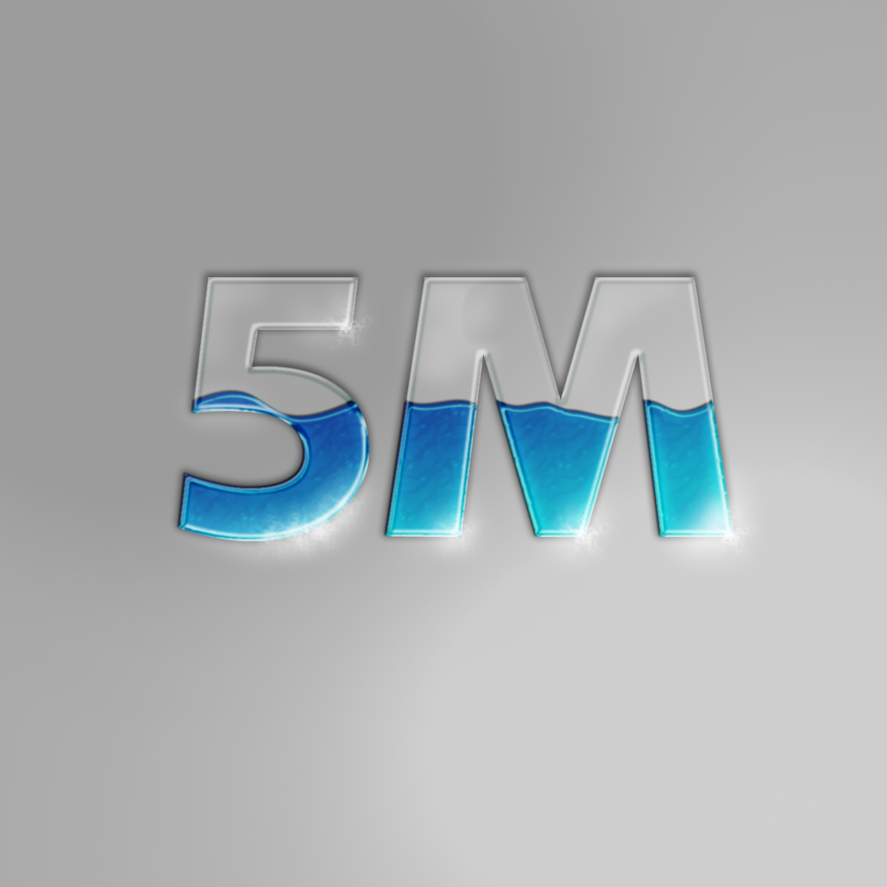
Experimentation for creating an effect of fluid within glass.
My very own experiment (observation, not tutorial) for making TRON effects text.


A grungy, gritty, urban sticker.


Playing with effects, layer masks, expanding my brush collection, expanding my font database and many other ways of toying around with this magnificent program is the way to achieving true design inspiration.

Of course, first you need to learn HOW to use the software.

I am still going through that journey, and it is indeed a long, winding road.

I STILL cannot do anything magnificent with PICTURES!!!


I use another, simpler program to accomplish that task, but they are indeed small edits. Nothing much to be raving about.

This vacation will be the perfect time for me to isolate myself from my normal interactions and truly develop the skills needed to take myself to the next level.

Both in terms of artistic development and academics.

CXC is next year >.<

Friday, May 6, 2011

The Human Figure Drawing

Since my last post, we have begun an aggressive study of the human figure.

Every class so far has either been about our discussions for a secret project in late October of this year.....

Or we have been drawing contour and stick figures of each other to attain a better understanding of the human body and to firsthandly experience the power of proportion!!

Here are a few pics of what we've been up to:


A fancy pose by Mrs. Tappin - Davis

A drawing of Duane drawing


All of these were done in charcoal stick in literally under a minute each.

We are working on speed drills...trying to capture as much of the essence of the person and their personality as quickly as possible.

The next stage will be to start putting flesh on these figures...and precious details.

Sunday, April 24, 2011

HOUSE


I am a passionate photorealist. I cannot fully appreciate pieces that lack detail unless they vividly depict a deeper, alternate meaning than what is presented at face value. I strive with all of my being to include as much detail as possible into all of my pieces. The full effect of photorealism is achieved through the application of high contrast, painstaking shadowing and the inclusion of as many details as possible.

In portrait work, it is even more important to pay attention to these principles in order to create an impressive replica of the subject in portrait.

However, one must also pay rapt attention to the details of the layout of the face and the person's features. Accuracy in this department will aid in ensuring that the portrait looks just like the person.

A fellow blogger, Portia Subran (a.k.a. DeadEyes), has experience in developing portraits.

You can find her at The Art of Wisdom and War


Anyway, its my turn to show 'off' my portraits too.

It's been a while since I've done a proper portrait. 

Not counting the one I've just completed, the last portrait I created was completed on the first of September last year.

Wow....it's been a while.

Personally, I think that I have definitely improved upon my techniques and my rendering capabilities but I definitely have to continue working hard at improving my accuracy and proportion mapping.


The following picture shows the first portrait I EVER completed:

A 'failed' portrait of Dr. House  


House M.D. (Portrait 1), Graphite on paper: 14" X 17".
I definitely have improved since then.


If you take a close look at the portrait, I signed this piece over a year ago.

Since then, things have changed.


My ability to achieve shadowing has improved and I am proud of what I am able to achieve nowadays in my artistic studies and exploration of expression.
I was heavily advised to stop doing portraits of these famous people, so I thought I would let them go out with a bang.


One year later, I decided to take Dr. House for a spin again...

 
I definitely am proud of my improvements, but I leave the verdict up to my readers to tell me where I have to continue the physical practice and research necessary to become a better portrait artist.


Simply more than a year has helped me improve my techniques to a level beyond my own expectations.

On the 22nd April, 2011 This is how the NEW House M.D stands:


House M.D. (Portrait 2), Graphite on paper: 17" X 22".
Improvements galore.


So concludes another vacation in the life of a dedicated student and a very tired human being. The trials of academics and art help make me stronger at least, so there is some good that comes out of hard work.....

This is my last portrait of an internationally famed person who is not locally based.
In the future, I may post some pictures of my previous portraits which include the likes of Queen Latifah, The Joker, Taylor Swift, and last (but not least) Ellen DeGeneres.

Due to my return to the hectic life on Tuesday, my posts may start to dwindle in frequency, but I will try to update as best as I can.

Sunday, October 10, 2010

Entry 2

ARTIST’S LOG
Entry2
07/09/2010


Minimal practical work was done in today’s class due to restraints in time. However, we learnt many new theoretical aspects and guidelines by which we can improve our work, especially in the branch of graphic design such as the elements and principles of design. Exercises in balance were also conducted as seen below.

The simple geometric shape of the circle was drawn three times within a rectangular box. Each circle per box was given a different size to change the balance of the box.
Balance is affected by size, colour and placement of the object, so bigger, darker, lower objects will appear heavier while small, lightly coloured, high objects appear lighter.

The Elements of design are:
  • Line                          
  • Shape
  • Form
  • Colour                      
  • Texture (tactile or visual)
  • Space
  • Value

The terms tactile and visual as it relates to texture refer to the use of realism or optical illusions. For example, using body paint, one can change one’s skin colour to an inhuman metallic effect detectable by the eyes, but the skin still feels normal to the touch. This can be manipulated in graphic design to achieve unique effects in relation to the piece under construction.

The Principles of design are:
·         Balance
·         Emphasis
·         Movement
·         Pattern
·         Rhythm

LinkWithin

Related Posts Plugin for WordPress, Blogger...

Popular Posts Last Week